UX Design Project
Trendy Musician Merch App
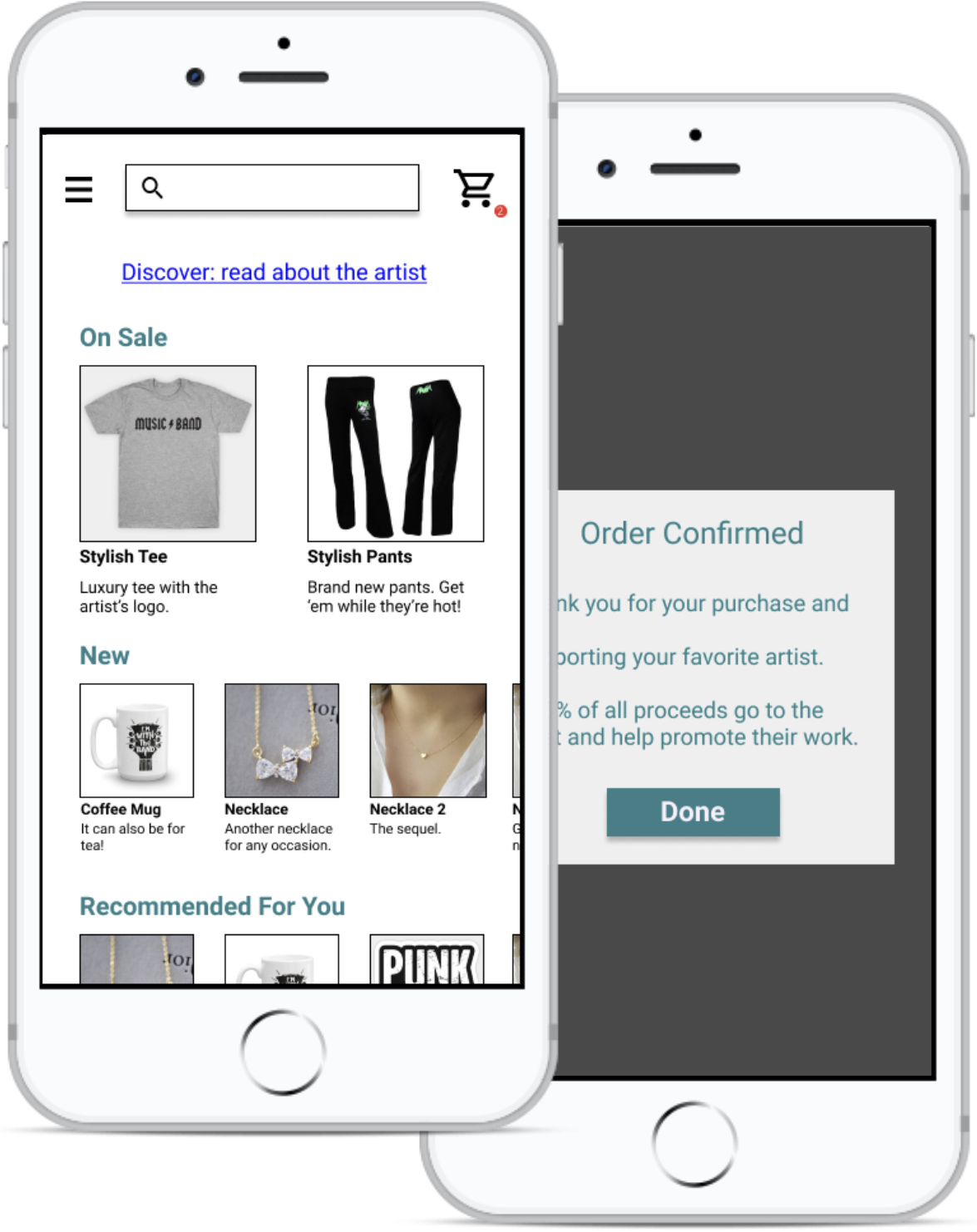
The problem: Musicians need a way to sell their merchandise directly to their fans through their own custom app.
The goal: Design a customizable app that acts as a marketplace where musicians can sell their products directly to fans, and where 100% of the proceeds to directly to the artist.
My role: UX designer – conducting interviews, paper and digital wireframing, low and high-fidelity prototyping, conducting usability studies, accounting for accessibility, and iterating on designs.
The idea for this project was assigned from a random prompt.
User research
I conducted interviews to find out how users of different monetary and social backgrounds would prefer to purchase merchandise from their favorite musician. I explored a diverse set of potential users – music lovers – who have a favorite band or musician, ages 16 and older.
The research confirmed that most users would prefer an app over a desktop web experience, and appreciated the idea that proceeds would go directly to the artist. Users also liked the idea of having a separate and custom marketplace for each musician rather than a single store for many artists.
Pain Points
Cost
Young professionals were concerned about the cost of the merchandise. They would only consider buying reasonably-priced items.
Convenience
Potential users wanted the convenience of having products delivered to their home on demand.
Supporting artists
Most users were concerned about platforms taking cuts of the musician’s revenue. They wanted a way to support the artist directly.
Personas
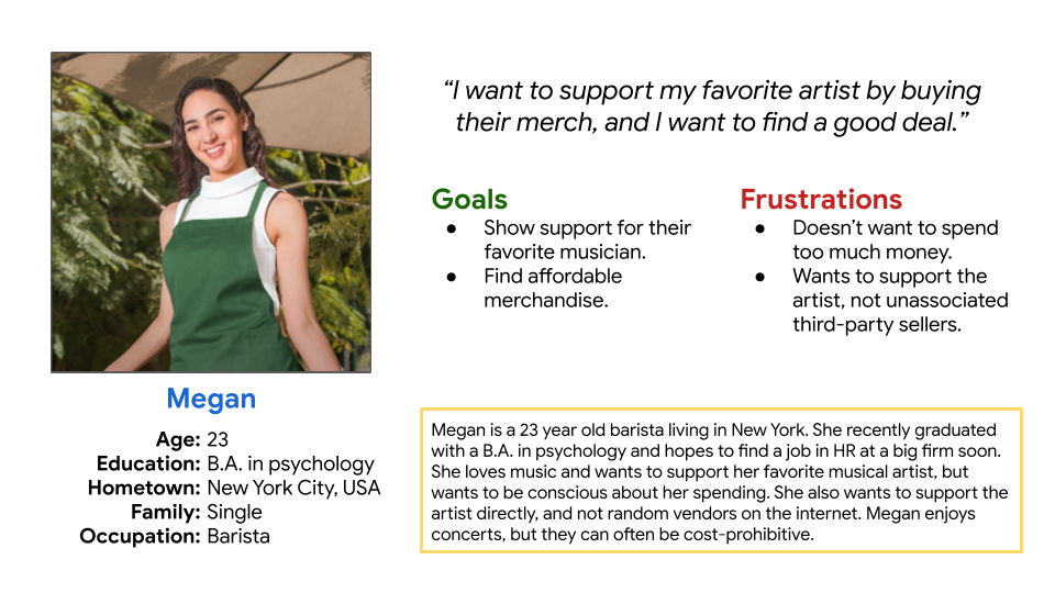
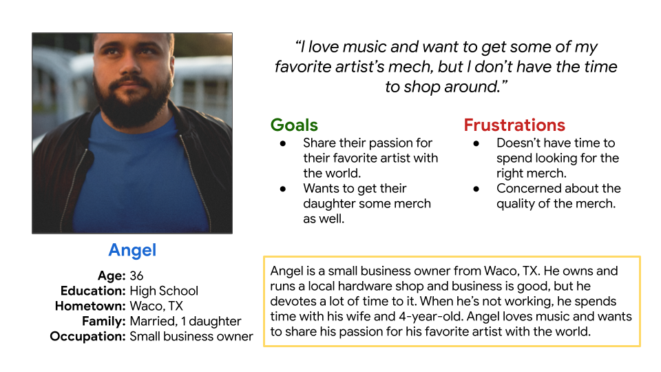
I developed personas with the characteristics of potential users of the app that reflect the wants and concerns of the user research participants.
Wireframes
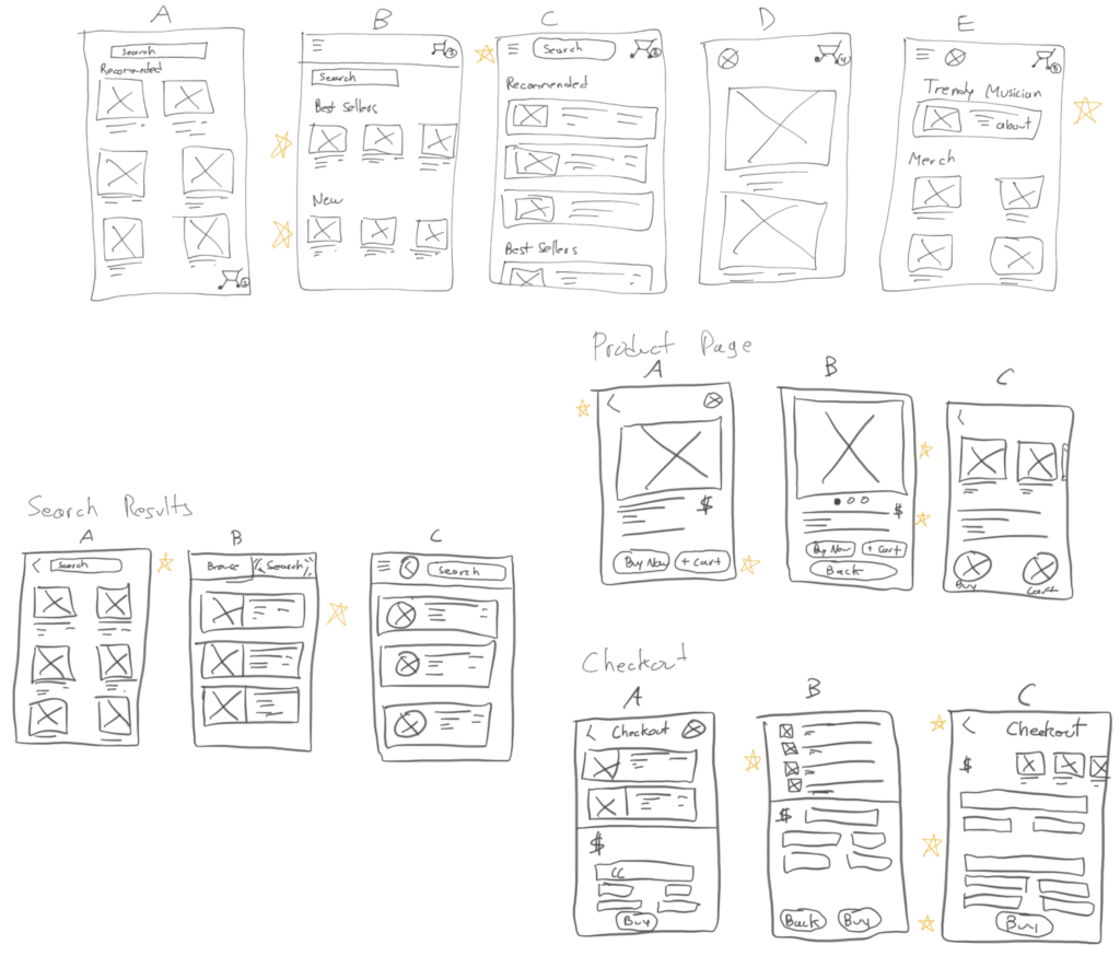
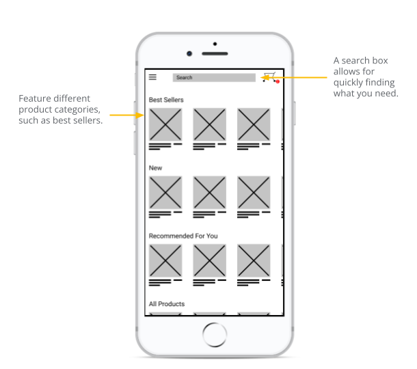
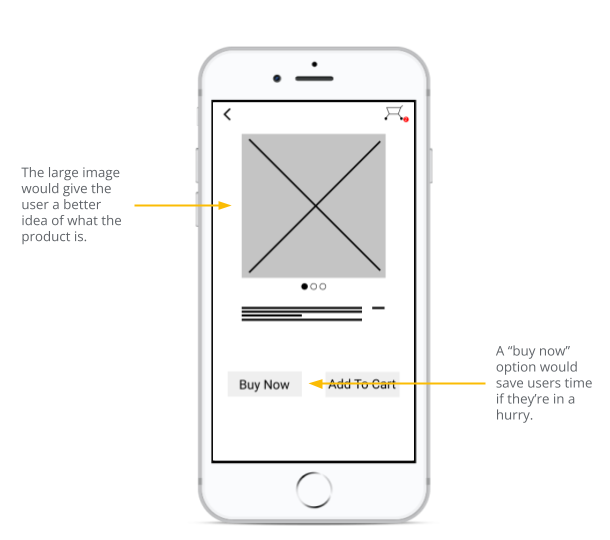
For the next step, I developed some wireframes. I first sketched “paper” wireframes (using an iPad with Apple Pencil), and then converted my favorite ideas from the sketches into digital wireframes.
Low-fidelity prototype
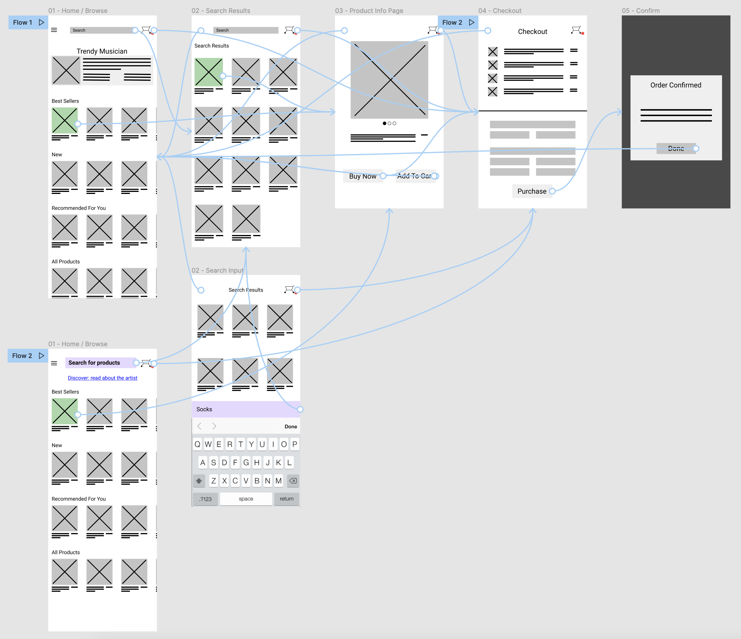
Once the wireframes were finished, I created a low-fidelity prototype to demonstrate user interaction with the app. I used the prototype to conduct a usability study before creating final mockups.
Usability study
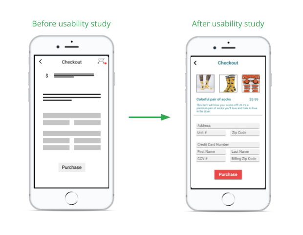
I conducted two rounds of usability studies. The first round helped identify improvements needed in the search and browse features. The second round provided some insights about the checkout process.
Round 1 findings
- Users wanted the app to focus on the merchandise.
- Users wanted better search behavior.
- Users wanted better accessibility.
Round 2 findings
- Users liked the fast checkout option.
- The cart checkout experience was frustrating.
Mockups
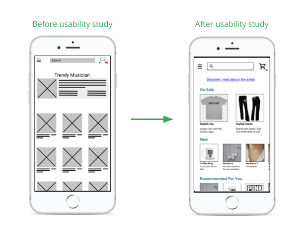
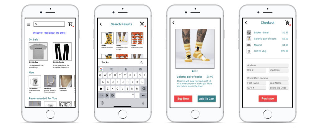
Following the usability studies, I created mockups for all of the screens and incorporated the participants’ feedback.
High-Fidelity Prototype
The final high-fidelity prototype demonstrated a cleaner user flow to browse or search for a product and go through the checkout process.

Accessibility Considerations
Search Bar
The search bar needed to be clearly labelled and accessible. Adding visual cues and an icon helped users identify where to tap when looking for a specific product.
High Contrast Colors
I made sure to use a higher-contrast color scheme so that all users, including those with visual disabilities, could find key action buttons and navigate the app.
Consistency
A consistent button design allowed users to quickly identify where to tap. I also used familiar icons to help users identify different actions within the app.
Takeaways
Impact
The Trendy Musician Merch App takes into consideration key user needs – convenience, price, and supporting the artist directly.
Quote from a user’s feedback: “I love how easy it was to just buy something quickly. I’d definitely use this app to support my favorite band!“
What I Learned
While designing this app, I learned the importance of user feedback and design iteration. My research participants told me about concerns and shared ideas that I never would have considered otherwise, and it was great to see users acknowledge those improvements in new iterations of the design.
Next Steps
More User Studies
Better Design Examples
Sharing The Design
Try out new shared components in Figma, and make the designs shareable with engineers.
