UX Design Project
Smalltown Bank Balance Transfer Flow
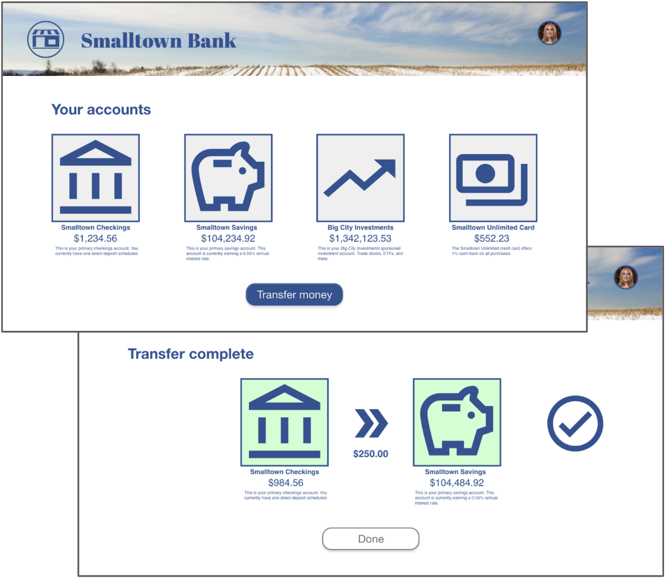
The problem: Smalltown Bank (a fictional, small-town rural bank) needs a way for its customers to easily transfer money between their accounts. This process tends to be complicated and challenging for many of the bank’s typical users.
The goal: Design a balance transfer flow that will be simple, easy to use, and an effective way to get users to handle their balance transfers online.
My role: UX designer for the website and app – conducting interviews, paper and digital wireframing, low and high-fidelity prototyping, conducting usability studies, accounting for accessibility, and iterating on designs.
The idea for this project was assigned from a random prompt.
User research
I conducted user interviews to build empathy maps so that I could better understand the target user and their needs. I discovered that many of the users struggled with complicated and poorly-accessible designs, and preferred to do their banking in person or over the phone. They were willing to try an online solution as long as it was easy to learn and use.
Pain Points
Starting A Transfer
Selecting Accounts
Low Accessibility
It was difficult for some users to see the text on some other banking websites.
No Mobile Option
Personas
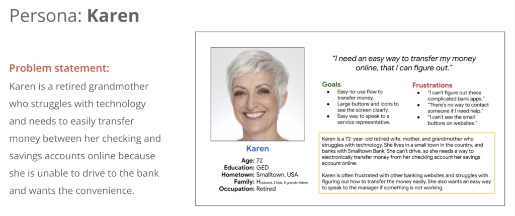
I developed personas with the characteristics of potential users of the app that reflect the wants and concerns of the user research participants.
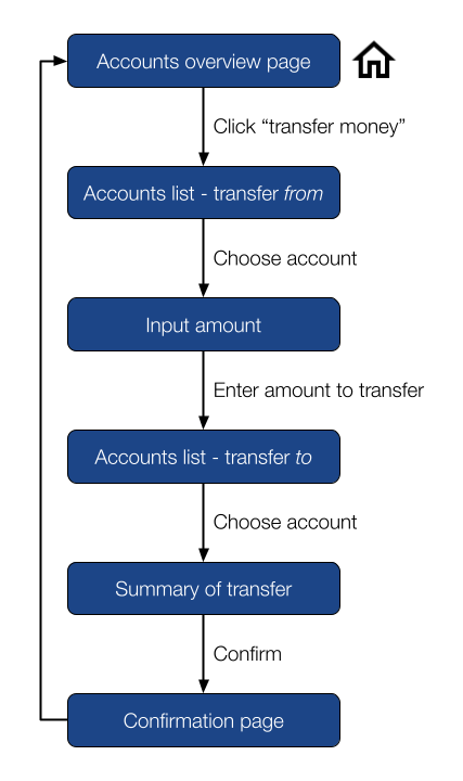
Sitemap
Wireframes
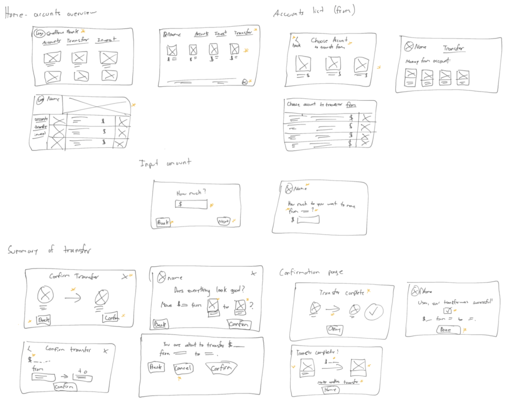
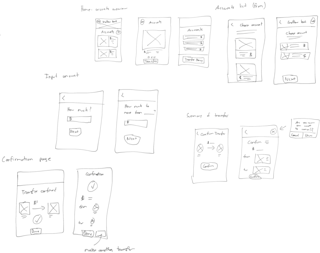
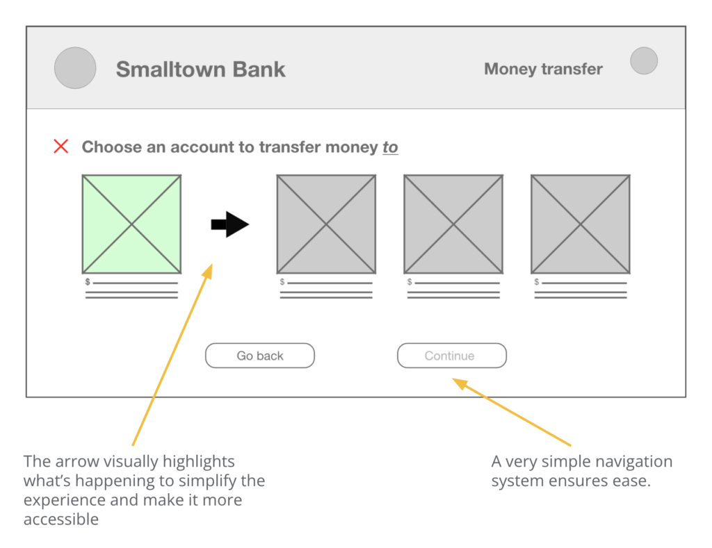
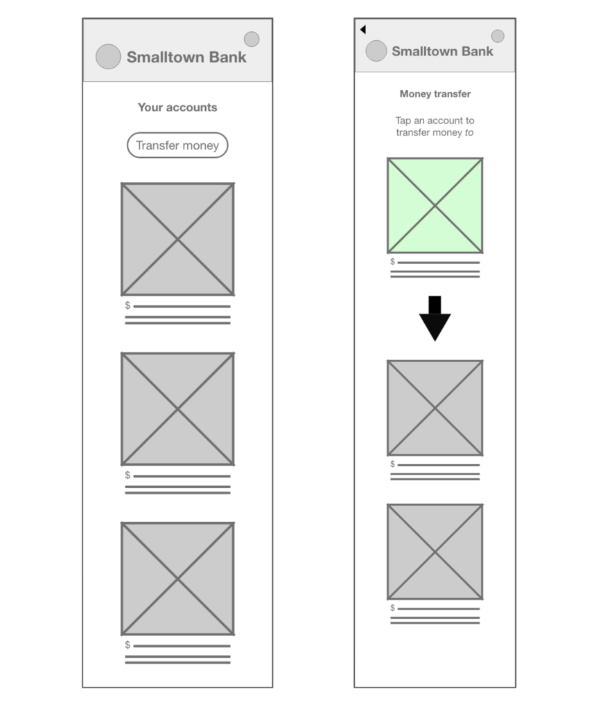
Next, I sketched “paper” wireframes (using an iPad with Apple Pencil), and then converted my favorite ideas from the sketches into digital wireframes. For this project, I also created a variation of the wireframes for mobile, in addition to the website. I used Adobe XD for the digital prototyping.
Paper Wireframes - Web
Paper Wireframes - Mobile
Digital Wireframes - Web
Digital Wireframes - Mobile
Low-fidelity prototype
Once the wireframes were finished, I created a low-fidelity prototype in Adobe XD to test user interaction with the app.

Usability study
After setting up the low-fidelity prototype, I conducted a usability study for the web flow.
Study type: unmoderated usability study.
Location: rural United States, remote.
Number of participants: 5.
Length of each session: 20-30 minutes.
Usability Study Findings
- The "next" button wasn’t clearly visually distinguishable from the "back" button.
- The prototype had no way to cancel the flow in an obvious way.
- Participants wanted clear wording to describe each step of the process.
Mockups
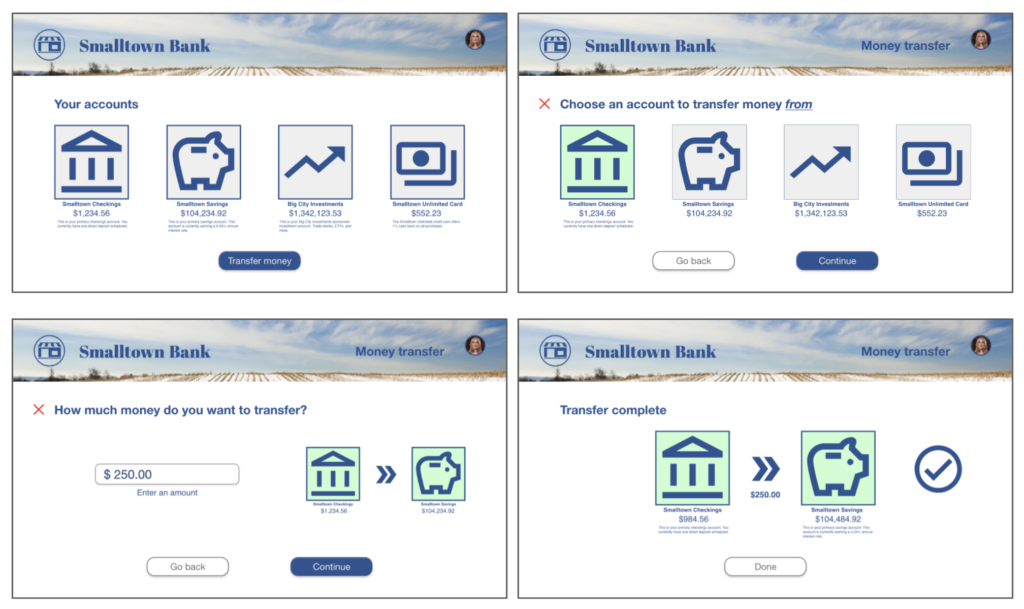
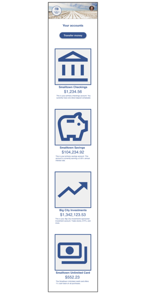
Taking feedback from the usability studies into account, I created mockups for all of the screens of the website as well as the start screen of the mobile app.


High-Fidelity Prototype
Finally, I created a high-fidelity prototype using the mockups and taking into account user feedback.

Accessibility Considerations
Large Images
Simple Navigation
Large Fonts
Takeaways
Impact
What I Learned
This project highlighted the importance of taking accessibility into account from the very beginning. I also learned how to take the accessibility and user flow concepts from the website and incorporate them into a mobile layout.
Next Steps
More Web User Studies
Conduct a follow-up usability study for the website.
