UX Design Project
CityBoost
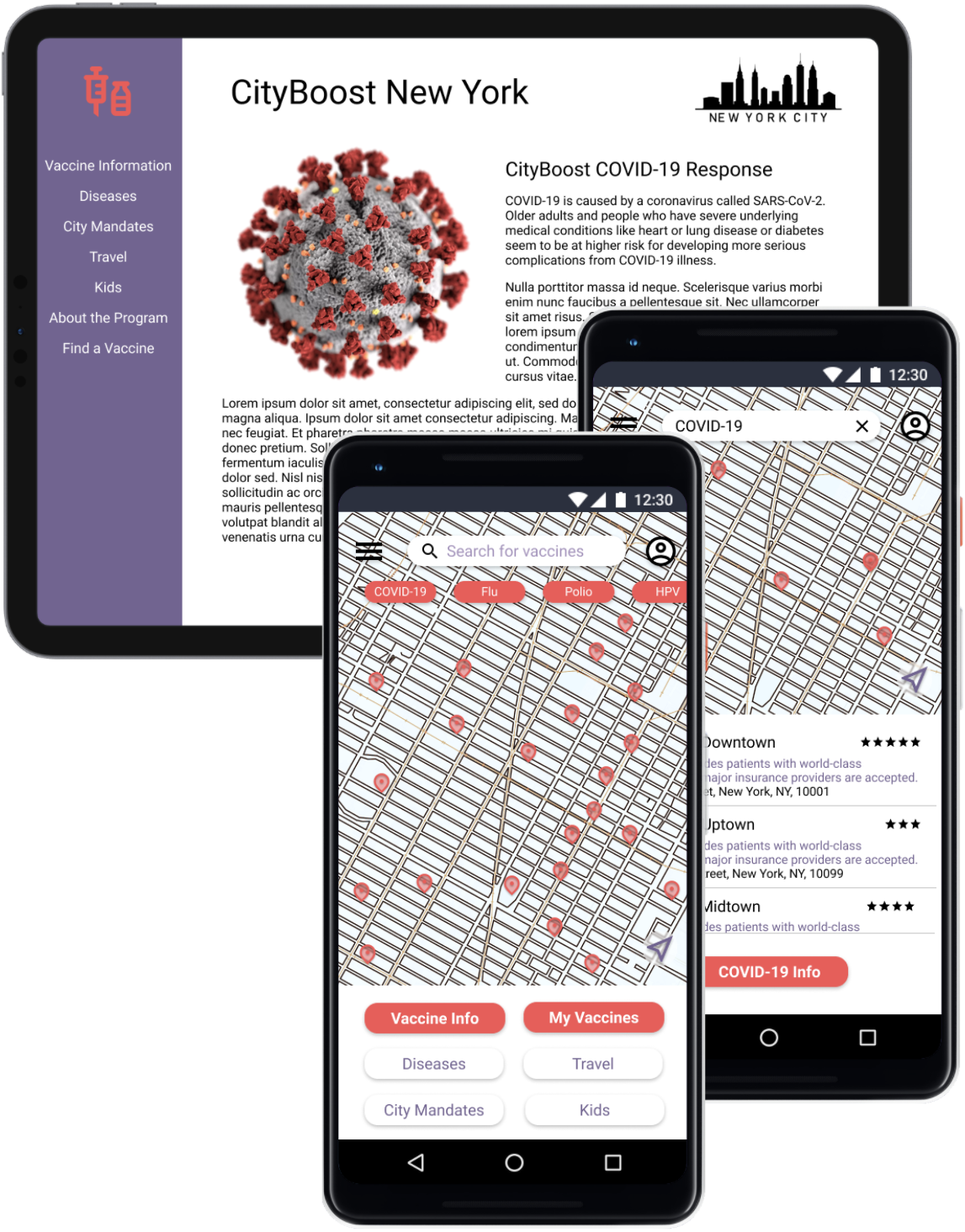
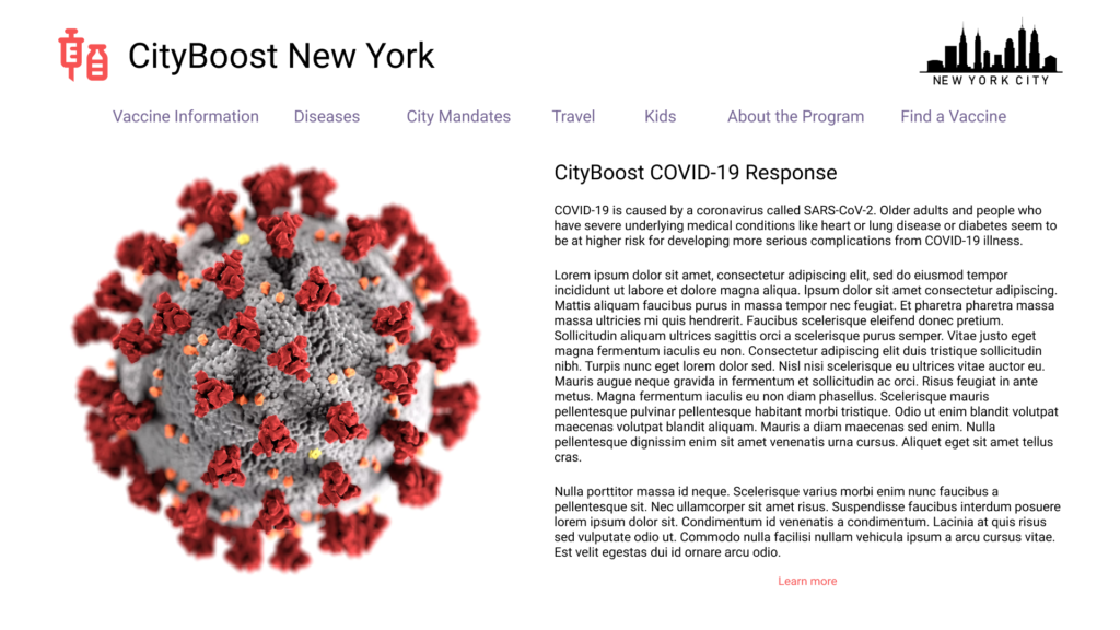
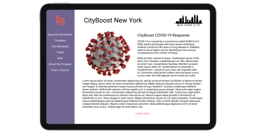
CityBoost is an app that helps residents of a city find vaccination sites for themselves and their children. It also provides critical information to citizens about different diseases and vaccines. While the mobile experience focuses on quickly finding a vaccination site, the responsive website focuses on providing users with important information.
The problem: Citizens do not always have ways to easily find vaccine sites or verified information about diseases and vaccines. To promote the overall health of a population, it is beneficial for cities to provide their citizens with an app that allows them to easily find clinics and information.
The goal: Design an app that allows users to search within their city or metro area for all vaccination locations, and enable them to look up and find the most up-to-date information on diseases and vaccines.
My role: UX designer for the mobile app and responsive website – conducting interviews, paper and digital wireframing, low and high-fidelity prototyping, conducting usability studies, accounting for accessibility, and iterating on designs.
The idea for this project was assigned from a random prompt. This project was a part of a design for social good challenge.
User research
I developed interview questions based on the current ways people find vaccine locations and vaccine health information. Most participants use search engines to look up information and map apps to locate clinics.
Participants stated that they struggle to find sources of information they can trust, and they often don’t know which information is accurate. Participants also struggled to locate clinics that provide specific vaccines for themselves and their children, and often resorted to calling various locations before visiting to see if they provide the needed services.
Personas
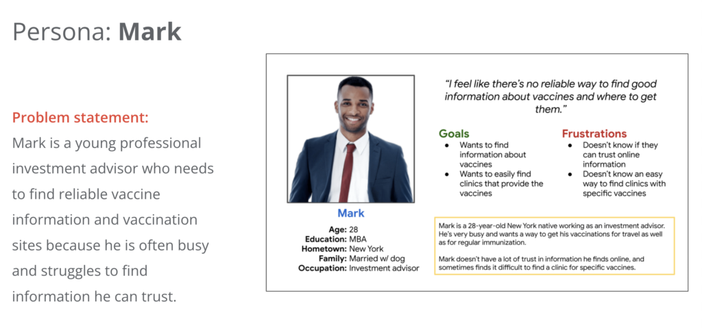
I developed personas with the characteristics of potential users of the app that reflect the wants and concerns of the user research participants.
Ideation
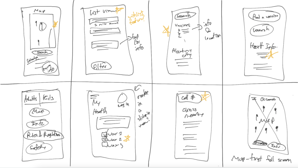
To start the design process, I did a quick ideation exercise (crazy eights) to come up with some solutions focusing on quickly finding vaccines in the user’s area. I drew stars next to some of the ideas that stood out to me.
Wireframes
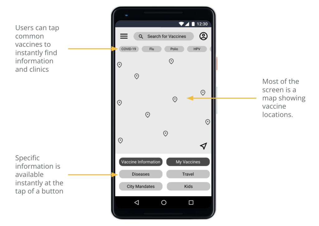
Next, I compiled the ideas I sketched earlier and created digital wireframes for the app.
Low-fidelity prototype
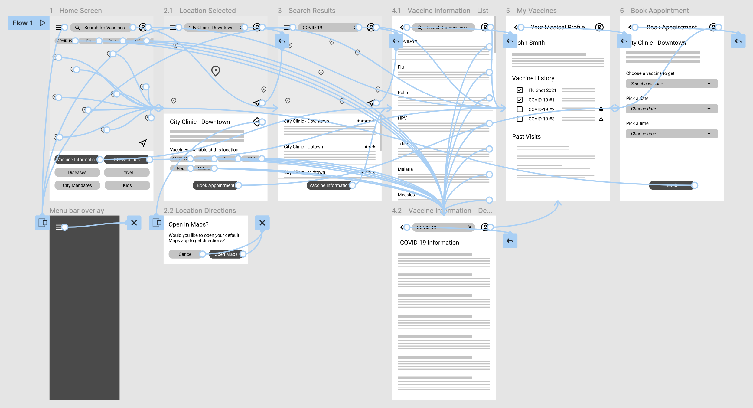
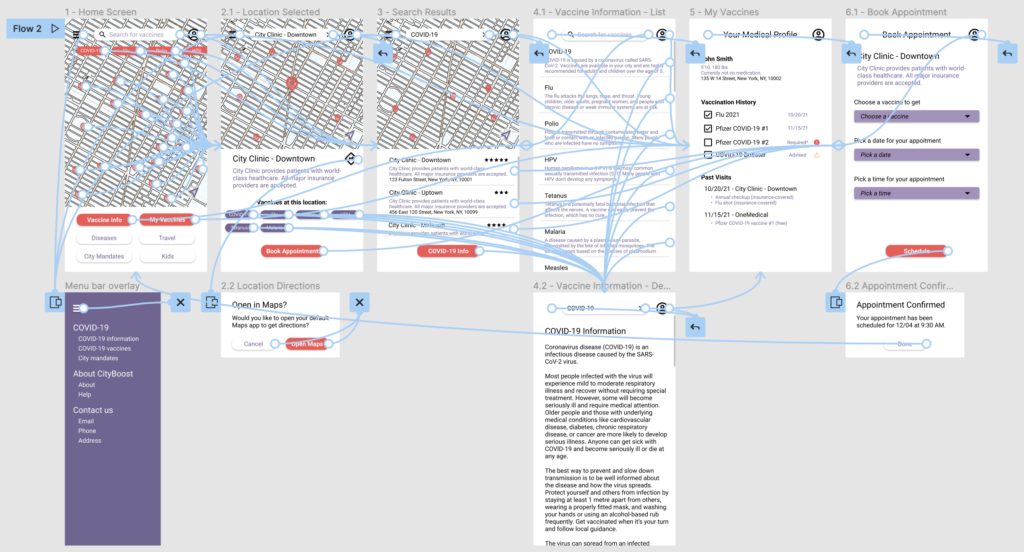
To prepare for usability testing, I created a low-fidelity prototype that demonstrated the user flow of finding a vaccine clinic and information about that vaccine.
Usability study
After setting up the low-fidelity prototype, I conducted a usability study for the mobile app.
Study type: unmoderated usability study.
Location: cities in the United States, remote.
Number of participants: 4.
Length of each session: 30-40 minutes.
Usability Study Findings
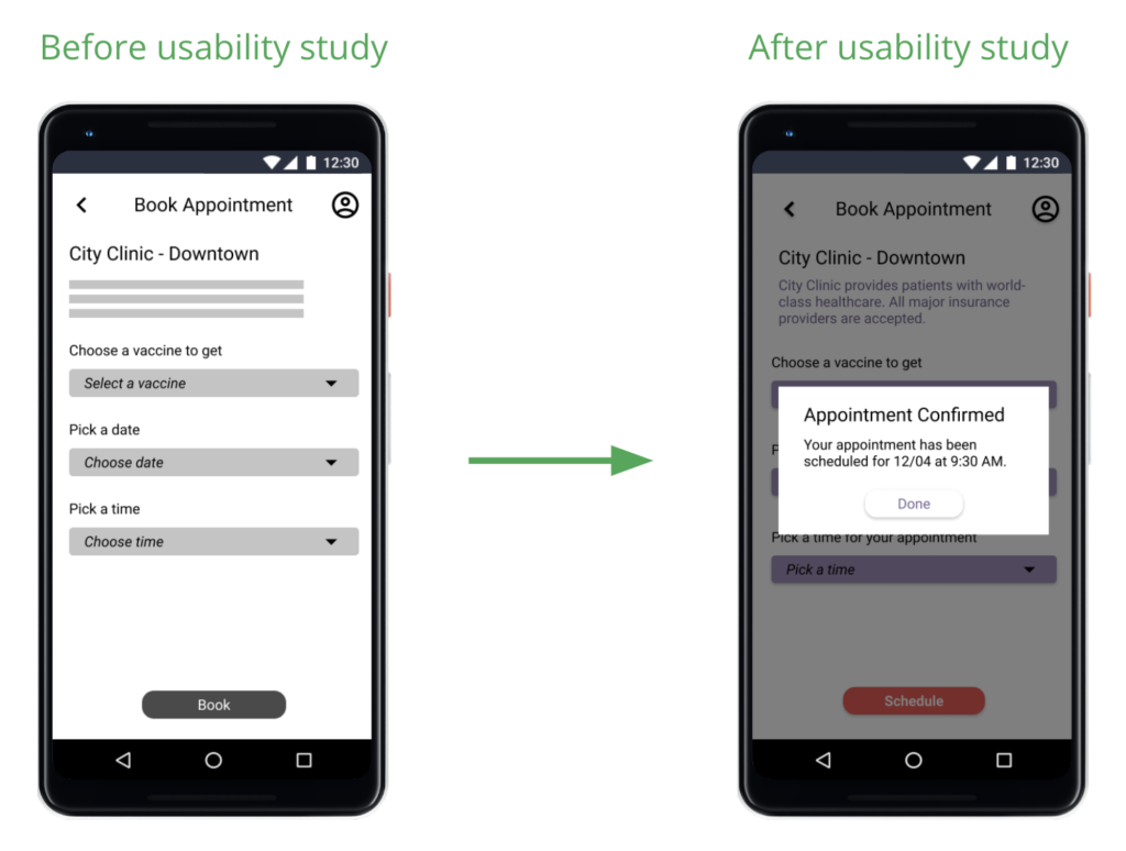
- Users wanted a confirmation when they booked a vaccine appointment.
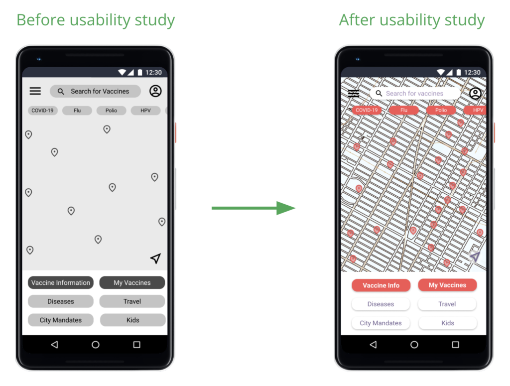
- Users weren’t clear on how the map worked in the prototype.
- Users wanted the ability to tap on a vaccine bubble to get more information in the single clinic view (screen 2.1 in the prototype).
Mockups
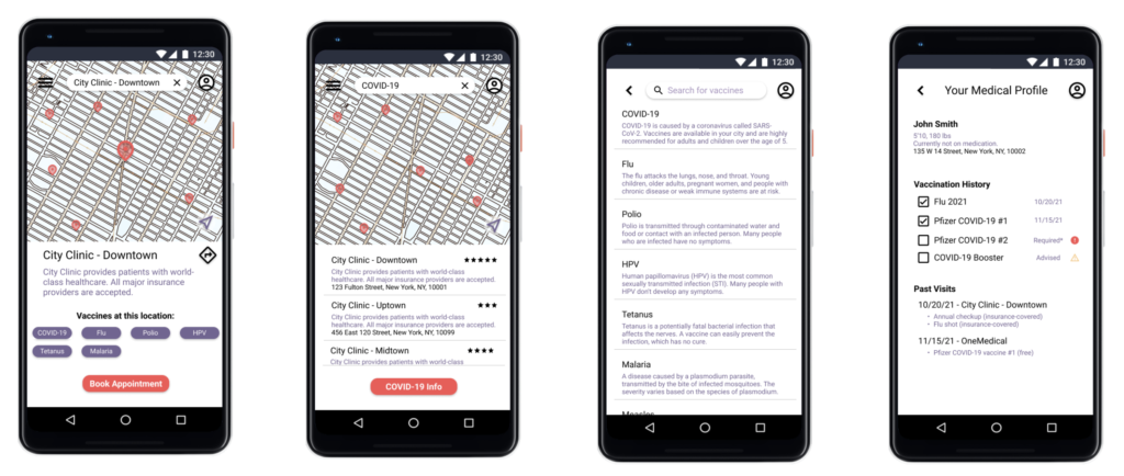
Next, it was time to create mockups for the app, incorporating the findings from the usability study.
High-Fidelity Prototype
The high-fidelity prototype followed the same user flow as the low-fidelity prototype, but included changes from the usability study feedback.
Accessibility Considerations
Icon Visibility
Clear Labels
High-Contrast Text
Critical pieces of text use a very high contrast (black on white) instead of relying on the less-contrasting theme colors.
Website Design
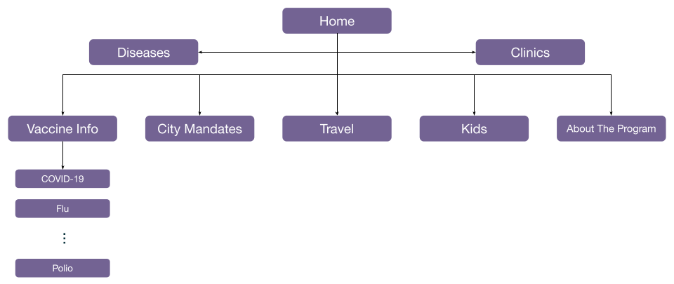
Sitemap
Responsive Website Design - Desktop
Responsive Website Design - Tablet
Takeaways
Impact
Users shared that the app would allow them to quickly find the vaccines they need, and that having easy access to trustworthy information about common vaccines and diseases was really useful. The website further complemented the app as a source of trusted information, which would be verified directly by city officials.
What I Learned
It was interesting to find ideas that solved problems for citizens in urban areas. I realized that many common problems are simply ignored, and new designs can be used to help people navigate daily life more easily.
